BENV1010
Saturday, April 25, 2020
Friday, April 24, 2020
Monday, April 20, 2020
5 handmade models draft
Sunday, April 19, 2020
Process images draft
Sunday, April 12, 2020
Wednesday, April 8, 2020
Wk 8
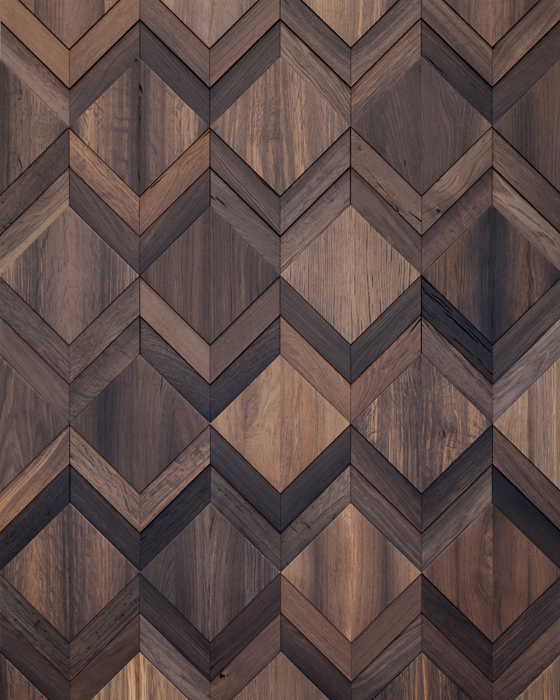
materials used for photoshop task:
I chose these materials......
 |
| I chose concrete rendering for as a subtle compliment to the side of the building as the front of the room already had a lot going on |
 |
| I wanted a bright feature as the rest of the model was quite dark, however, I had to slightly darken it as it stood out too much |
 |
| This is the model that I photoshopped into the environment. I flipped it and warped it as it was too angular compared with the background |
 |
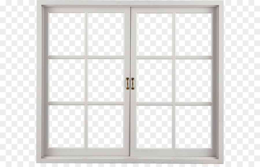
| I chose this window as I thought it made the building feel more refined and added detail to an otherwise basic window |
the window was very tedious to cut out but I thought the end result was good.
 |
| Wk 8 photoshop task: Material composition this allowed me to visualize the model to a real-life scale |
Wednesday, April 1, 2020
Wk 7 studio activities
I really liked how this looked very different depending on the perspective it was looked at as well as the different shadows it cast as the sun moved
(1:20)
indoor lighting. I felt that the flashlight was very harsh and the room was a bit too dark
my room scaled at 1:50 with fibreboard
I then added the upper level with a wide-open window to reflect in light
criticism:
- can see the tape
- the material wouldn't cut clean
- it was a tough material to cut
net of the room with thin cardboard (1:20)
experimenting with shadows by rotating the flashlight to imitate the sun
my 1:20 scale room
reiteration of the fibreboard model using cardboard
experimenting movement of lighting (different times of day)
I liked the stacking of different shapes
Fusion 360 model using initial KAT
I found this one pretty straightforward by watching the videos and didn't experience any issues with it
 |
| Sketch of a possible addition to my model (incorporating the folding techniques) |
Subscribe to:
Comments (Atom)
-
Criticism to improve on: - Crowded composition - Have a more grid layout - Get rid of hatching - Change font - Add more description ...
-
I really liked how this looked very different depending on the perspective it was looked at as well as the different shadows it cast as t...


